
A new way to preview our themes
17 Feb 2014 - Written by Anthony Olsen
Posted in About the Club
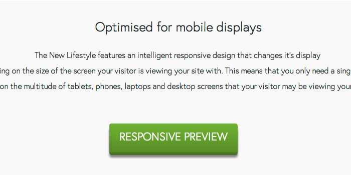
As a part of our redesign last month. I added a new way to preview our responsive Joomla templates.
The responsive preview button when clicked will load the template's demo site in an iframe and display some icons that allow you to change the size of the demo site.
So you can quickly see how the design changes as the screen size changes.
The neat thing about this is that we lazyloaded the iframe via the use of data attributes so that we weren't loading the demo site on each and every page load and only if the visitor wants to see it.
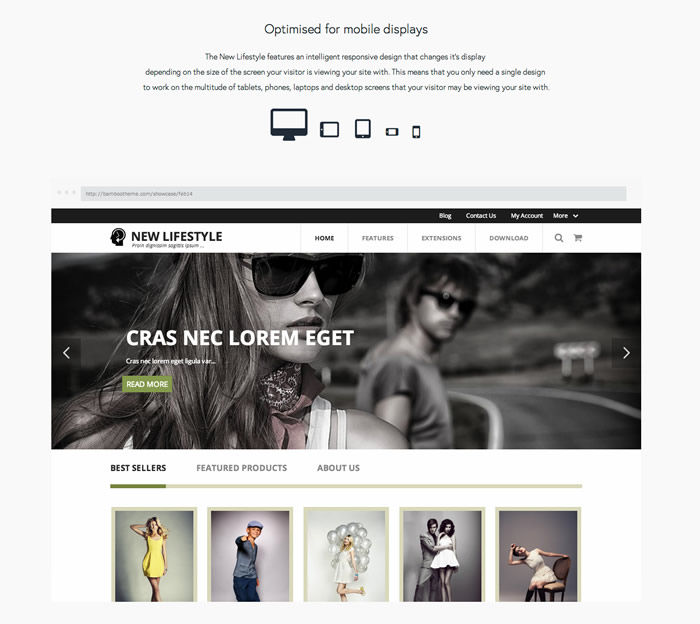
New Lifestyle demo frame
Here is the New Lifestyle template in fullscreen mode.
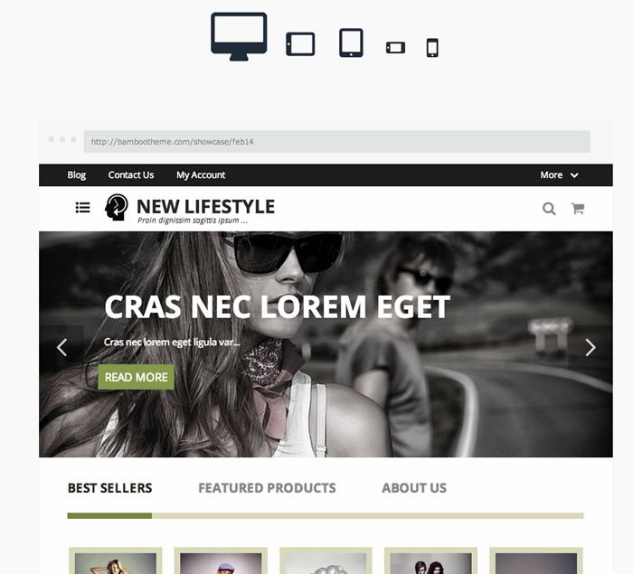
Here is the New Lifestyle template in tablet portrait mode.
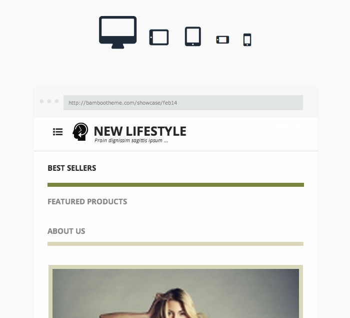
Here is the New Lifestyle template in landscape phone mode.
How did we do it?
If you are interested the code itself is pretty simple. It just uses the jQuery .attr() attribute which allows us to manipulate the contents of the iframe.
The jQuery (assumes jQuery is loaded on the page and running in noconflict mode.
 jQuery("#preview").click(function(event){
      jQuery("#demoframe").attr("src", jQuery("#demoframe").attr("data-original"));
      event.preventDefault();
   });
And then a link to attach the click function to.
<a id="preview" class="btn" href="#preview"><span>Responsive preview</span></a>And then the html markup for the iframe itself.
<iframe data-original="http://bambootheme.com/showcase/feb14" frameborder="0" id="demoframe" allowfullscreen=""></iframe>We also added a loading animation and some nice fade in fade out behaviour on the elements but the code above should replicate that functionality.
Enjoy!
blog comments powered by Disqus