A responsive skeleton Joomla Template
22 Sep 2011 - Written by Anthony Olsen
Posted in Joomla Templates
The Responsive Joomla Template is a new skeleton template for Joomla 1.5 and Joomla 1.7 that we hope to unveil early next week. Over the last few days Ive plugged into development of v2.0 of the Zen Grid Framework and have made some real progress that should mean that we will see a stable release next week as well.
The Responsive Joomla template will be the first template released on the new version of the framework and as you will see from the screenshots its a mobile friendly clean skin for you to start developing your sites with.
On a side note ... A unified framework and Joomla template.
The big news is that v2.0 compatible Joomla templates will be a unified package - ie they will work on both Joomla 1.5 and Joomla 1.7. This is a massive boon for us as it will speed up the development and release process, but it also means members will no longer need to worry about discerning between J1.5 and J1.7 packages in our download area.
I'll post more on whats in the new version in the next few days and weeks but for now - take a look at a few snippets of the Responsive Joomla template's layout.
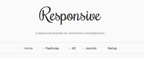
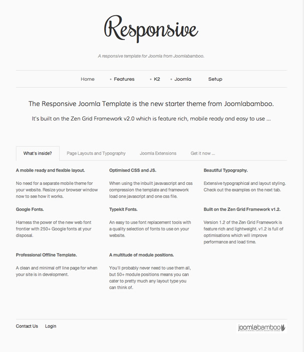
On Larger screens
A pretty standard grid based layout with some new useful settings like an extra logo position and the ability to render a centered logo and navigation area.
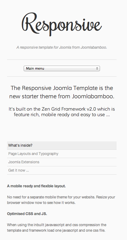
Smaller Screens
The template gives you the option to transform the superfish drop down menu into a select list that is a lot more friendly for mobile devices. The content is source order so on small screens the main content sits above the sidebar and at the top of the screen so users dont have to wade through a tonne of links to get your content.