

Vel voluptas sequi ea enim dicta similique vero. Cupiditate est perspiciatis quae nobis. Laboriosam corrupti exercitationem sit tempore quo qui. Autem et iure excepturi quas.
Caption Layouts
Caption - Style1
-
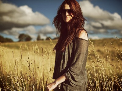
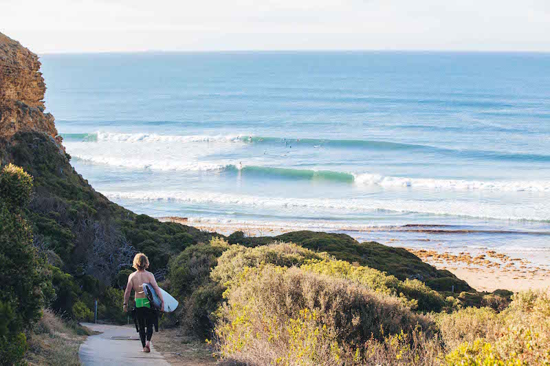
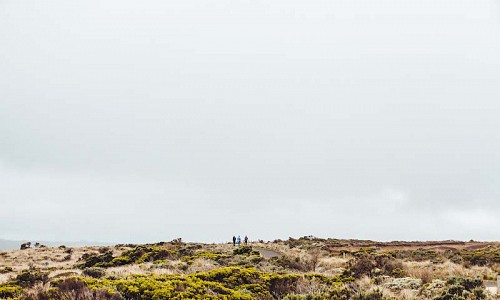
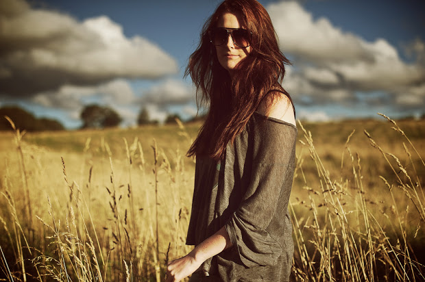
![In the fields]()
In the fields
-
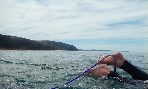
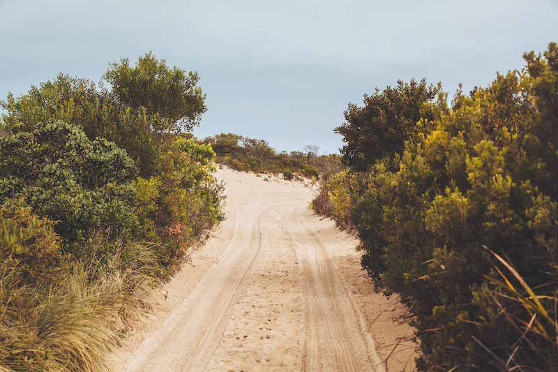
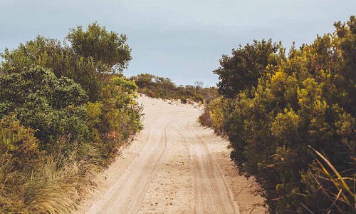
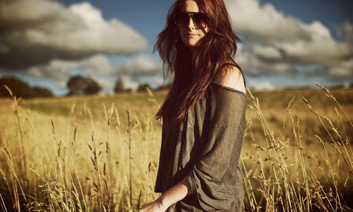
![On edge]()
On edge

Caption - Style2

Caption - Style3
Caption - Style4
Caption - Style5
Caption - Style6
Caption - Style7
Caption - No Margin
Grid Overview
The grid layout uses a flexible responsive grid that allows the user to set a maximum number of columns (1-6) to be used in any given layout.
This means that at it's widest point the grid will only be displayed in 1,2,3,4,5 or 6 columns. At screen widths larger than the desktop breakpoint the module will always display the maximum number of columns.
For instance if you set the desktop value to 1200px and the maximum column option to 4, then above 1200px the module will always display it's items in 4 columns.
At smaller screen resolutions the grid will collapse to a smaller number of columns to allow for the optimal display of images.
Maximum 3 column grid
The Grid below is set to display in a maximum of 2 columns. The settings in the module determine the points at which the grid resolves to 3,2 and 1 column.

Maximum 4 column grid
The Grid below is set to display in a maximum of 4 columns. The settings in the module determine the points at which the grid resolves to 3,2 and 1 column.
Maximum 2 column grid
The Grid below is set to display in a maximum of 2 columns. The settings in the module determine the points at which the grid resolves to 3,2 and 1 column.
-

Open Plain
-
Southside
Columns within grids
The Grid below is set to display in a maximum of 2 columns. The settings in the module determine the points at which the grid resolves to 3,2 and 1 column.
-
On the look out
Morbi vestibulum sagittis nisl, in iaculis est suscipit in. Aenean et semper elit. Nullam volutpat ligula ut vulputate porta. Nam dictum tortor enim, sed varius quam molestie ac. -
Southside of bells
Morbi vestibulum sagittis nisl, in iaculis est suscipit in. Aenean et semper elit. Nullam volutpat ligula ut vulputate porta. Nam dictum tortor enim, sed varius quam molestie ac. -

Walk to winki
Morbi vestibulum sagittis nisl, in iaculis est suscipit in. Aenean et semper elit. Nullam volutpat ligula ut vulputate porta. Nam dictum tortor enim, sed varius quam molestie ac. -
Scout
Morbi vestibulum sagittis nisl, in iaculis est suscipit in. Aenean et semper elit. Nullam volutpat ligula ut vulputate porta. Nam dictum tortor enim, sed varius quam molestie ac.
Marginless grid
The Grid below is set to display in a maximum of 2 columns. The settings in the module determine the points at which the grid resolves to 3,2 and 1 column.
Grid with overlay
The grid below is displaying a maximum of 3 column grids, with no margins and the title element overlaying the image.
Marginless grid with animated overlay
The grid below is displaying a maximum of 3 column grids, with no margins and the title element transitions into view when the user hovers over the image.
Boxed theme with equal heights enabled
The grid below uses the boxed theme and the setting to make the items equal height enabled. The equal height settings ensures that your grid of items maintains a uniform and consistent display.
-
Road to somewhere
Lorem ipsum dolor sit amet, consectetur adipiscing elit. Ut consequat ac eros efficitur sollicitudin. Donec mauris velit, blandit at leo eu, egestas scelerisque velit. Proin ut velit eget risus ullamcorper fringilla. Donec eu magna quis quam vehicula hendrerit id non mi. -
Edgyness
Lorem ipsum dolor sit amet, consectetur adipiscing elit. Ut consequat ac eros efficitur sollicitudin.
Boxed theme with equal heights disabled
The grid below uses the boxed theme and the setting to make the items equal height disabled.
-
In-the-fields
Morbi non ultrices velit. Curabitur ut ultrices diam. Mauris nec dolor sodales, dictum arcu sed, placerat nulla. Curabitur faucibus, sapien ac cursus scelerisque, mauris ante gravida massa, elementum auctor orci ante sed eros. Maecenas facilisis elementum ligula, eu pulvinar nunc aliquet id. Sed semper ex est, vel ultricies magna viverra quis. Etiam feugiat porta venenatis. -
Couch-man
List layouts
The list layout is a straight forward unordered list that is ideal for showcase content in a latest news or micro blog style format.
2 column list
The two column list below displays the item image in the first column and then items title, intro text and exif data in the second.
List
-
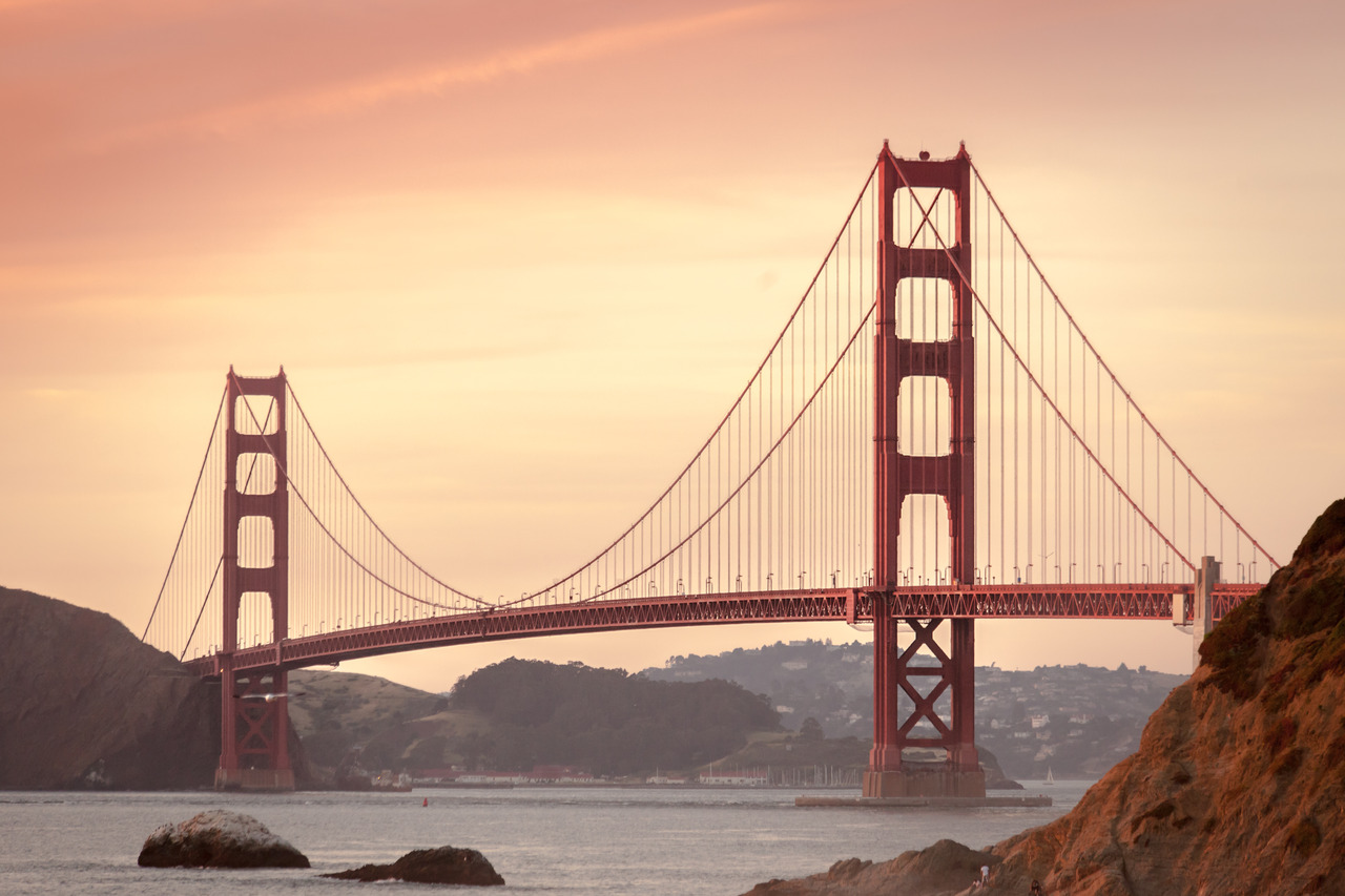
![Golden-gates]()
Golden-gates
Vestibulum eleifend pharetra erat, vitae fermentum ex laoreet vel. Aliquam egestas hendrerit finibus. Curabitur ullamcorper in turpis ut lacinia. Integer eget purus nec leo consequat rutrum id ut augue. Sed consequat mauris et augue pellentesque fermentum. ;Details
- Make - Canon
- Model - Canon EOS 5D Mark II
- F stop - f/5
- Focal length - 165 mm
-
![On-edge.]()
On-edge.
Nam facilisis lacus eu malesuada tristique. Curabitur cursus mollis nulla quis pulvinar. Ut ut maximus felis, nec venenatis tortor.Details
- F stop - false
- Focal length - false
-
![Walking-desert]()
Walking-desert
Nullam mauris lectus, pellentesque ultrices porta id, pulvinar interdum est. Aenean ut justo ut mi iaculis ultricies.Details
- F stop - false
- Focal length - false


List with boxed layout
-
![Golden-gates]()
Golden-gates
Vestibulum eleifend pharetra erat, vitae fermentum ex laoreet vel. Aliquam egestas hendrerit finibus. Curabitur ullamcorper in turpis ut lacinia. Integer eget purus nec leo consequat rutrum id ut augue. Sed consequat mauris et augue pellentesque fermentum. ;Details
- Make - Canon
- Model - Canon EOS 5D Mark II
- F stop - f/5
- Focal length - 165 mm
-
![On-edge.]()
On-edge.
Nam facilisis lacus eu malesuada tristique. Curabitur cursus mollis nulla quis pulvinar. Ut ut maximus felis, nec venenatis tortor.Details
- F stop - false
- Focal length - false
-
![Walking-desert]()
Walking-desert
Nullam mauris lectus, pellentesque ultrices porta id, pulvinar interdum est. Aenean ut justo ut mi iaculis ultricies.Details
- F stop - false
- Focal length - false
3 column list
The example below shows a three column list with the exif data moved from the second to the third column.
List 3 columns
-
![Golden-gates]()
Golden-gates
Vestibulum eleifend pharetra erat, vitae fermentum ex laoreet vel. Aliquam egestas hendrerit finibus. Curabitur ullamcorper in turpis ut lacinia. Integer eget purus nec leo consequat rutrum id ut augue. Sed consequat mauris et augue pellentesque fermentum. ;Exif Details
- Make - Canon
- Model - Canon EOS 5D Mark II
- F stop - f/5
- Focal length - 165 mm
-
![On-edge.]()
On-edge.
Nam facilisis lacus eu malesuada tristique. Curabitur cursus mollis nulla quis pulvinar. Ut ut maximus felis, nec venenatis tortor.Exif Details
- F stop - false
- Focal length - false
-
![Walking-desert]()
Walking-desert
Nullam mauris lectus, pellentesque ultrices porta id, pulvinar interdum est. Aenean ut justo ut mi iaculis ultricies.Exif Details
- F stop - false
- Focal length - false
4 column list
In the example below a fourth column has been added with a like button for each item.
List 4 columns
-
![Golden-gates]() Vestibulum eleifend pharetra erat, vitae fermentum ex laoreet vel. Aliquam egestas hendrerit finibus. Curabitur ullamcorper in turpis ut lacinia. Integer eget purus nec leo consequat rutrum id ut augue. Sed consequat mauris et augue pellentesque fermentum. ;
Vestibulum eleifend pharetra erat, vitae fermentum ex laoreet vel. Aliquam egestas hendrerit finibus. Curabitur ullamcorper in turpis ut lacinia. Integer eget purus nec leo consequat rutrum id ut augue. Sed consequat mauris et augue pellentesque fermentum. ;Details
- Make - Canon
- Model - Canon EOS 5D Mark II
- F stop - f/5
-
![On-edge.]()
On-edge.
Nam facilisis lacus eu malesuada tristique. Curabitur cursus mollis nulla quis pulvinar. Ut ut maximus felis, nec venenatis tortor.Details
- F stop - false
-
![Walking-desert]()
Walking-desert
Nullam mauris lectus, pellentesque ultrices porta id, pulvinar interdum est. Aenean ut justo ut mi iaculis ultricies.Details
- F stop - false
Aenean iaculis volutpat
Cras nec lorem eget ligula varius aliquet at et mi. Fusce id quam in justo suscipit porta. Fusce non nisl nunc, id vestibulum augue. Donec interdum sapien vitae sem condimentum vel adipiscing leo consequat. In quis nisi sed velit lobortis congue in vulputate risus. Aliquam molestie, risus sed congue ullamcorper, mauris lacus volutpat mauris, nec luctus est risus in libero.