Support Forum

Please note that this forum is only available to you in read only mode. In order to contribute to this conversation you will need to renew your subscription.

mobile view - hiding modules

zentoolsIf you use Zentools please post a review at the Joomla! Extensions Directory.

Hi

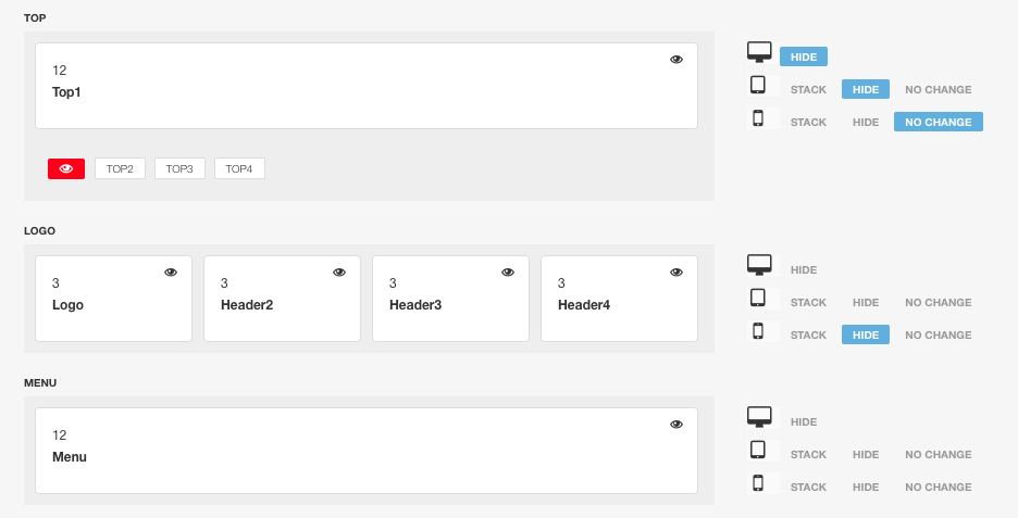
I'm trying to have 2 versions of the header in this website: engineroom.churchesaliveonline.com

One is published to the logo position, and the other (for mobile view) to Top1.

See the settings attached, along with the result. It works great until I turn my mobile sideways then both modules are visible, and they overlap each other.

Screenshot2016-02-0719.40.10.png


Screenshot_2016-02-07-18-06-04.png
  • jonburdon's Avatar
  • jonburdon
  • LIfetime Developer - Big Bamboo
  • 860 posts
  • Karma: 0
The administrator has disabled public write access.
Hi

What device are you using?

Cheers
Paul
  • manh's Avatar
  • manh
  • Moderator
  • 45248 posts
  • 2106 Thanks
  • Karma: 603
The administrator has disabled public write access.
Android Smartphone - samsung galaxy s3 mini
  • jonburdon's Avatar
  • jonburdon
  • LIfetime Developer - Big Bamboo
  • 860 posts
  • Karma: 0
The administrator has disabled public write access.
Hi

I don't have that device - looking at the emulators it looks ok so I would try adjusting the media query

Is not easy to troubleshoot this but I think this media query should work once you've adjusted the max width value as required

@media screen and (max-width: 620px)
.responsive-enabled #logowrap.hidden-phones {
overflow: hidden;
clip: rect(0 0 0 0);
height: 1px;
width: 1px;
margin: -1px;
padding: 0;
border: 0;
}
}
  • manh's Avatar
  • manh
  • Moderator
  • 45248 posts
  • 2106 Thanks
  • Karma: 603
The administrator has disabled public write access.
Do I add that to custom.css?
  • jonburdon's Avatar
  • jonburdon
  • LIfetime Developer - Big Bamboo
  • 860 posts
  • Karma: 0
The administrator has disabled public write access.
yes please
  • manh's Avatar
  • manh
  • Moderator
  • 45248 posts
  • 2106 Thanks
  • Karma: 603
The administrator has disabled public write access.
ah a missing bracket

@media screen and (max-width: 620px) {
.responsive-enabled #logowrap.hidden-phones {
overflow: hidden;
clip: rect(0 0 0 0);
height: 1px;
width: 1px;
margin: -1px;
padding: 0;
border: 0;
}
}

you would need to alter the max width value

Cheers
Paul
  • manh's Avatar
  • manh
  • Moderator
  • 45248 posts
  • 2106 Thanks
  • Karma: 603
The administrator has disabled public write access.
I've played around with the max width value a bit.

What I get is this: It loads fine with my small logo (as before)

When I rotate my device, the new wider logo appears but the small logo overlaps it (as seen in the original screenshot.) If I then keep the device held in this rotated position and refresh, the screen loads correctly.
  • jonburdon's Avatar
  • jonburdon
  • LIfetime Developer - Big Bamboo
  • 860 posts
  • Karma: 0
The administrator has disabled public write access.
Can you try using some of these media queries for S3 using the same class and styling

css-tricks.com/snippets/css/media-queries-for-standard-devices/

Cheers
Paul
  • manh's Avatar
  • manh
  • Moderator
  • 45248 posts
  • 2106 Thanks
  • Karma: 603
The administrator has disabled public write access.

zentoolsIf you use Zentools please post a review at the Joomla! Extensions Directory.
Happy Campers