Support Forum

Please note that this forum is only available to you in read only mode. In order to contribute to this conversation you will need to renew your subscription.

Grid3: logo on cell phone

zentoolsIf you use Zentools please post a review at the Joomla! Extensions Directory.

Okay - one last thing and I think the site is finished....
Site is here: rachelpopowcer.com

Everything looks fine on my computer, but the header/logo is strange on my cell phone - text is huge and the color/box behind it is small. I would like to have the logo text/site name smaller (it is just text, not a graphic), and the dark red box behind it fill the width, if possible.

I will attach a screenshot from my iPhone; it looks the same on a Windows phone.


RachelPhone-1.jpg


Thanks,
Melody
  • AllegroMelody's Avatar
  • AllegroMelody
  • 12 Month Developer
  • 534 posts
  • 1 Thanks
  • Karma: 2
The administrator has disabled public write access.
Hi Melody,

Can you try adding something along the lines of this for the font size

@media only screen and (max-device-width: 480px) and (min-device-width: 320px) {
#logowrap a {font-size: 2em !important;}
}

I'm using a browser tool to test as an iphone6

The current size is 3em

Cheers
  • manh's Avatar
  • manh
  • Moderator
  • 45248 posts
  • 2106 Thanks
  • Karma: 603
The administrator has disabled public write access.
After trying the font size can you try adding

@media only screen and (max-device-width: 480px) and (min-device-width: 320px) {
#logowrap {margin-top: 20px;}
}

to reduce the margin above

The current value is margin-top: 80px;

Cheers
Paul
  • manh's Avatar
  • manh
  • Moderator
  • 45248 posts
  • 2106 Thanks
  • Karma: 603
The administrator has disabled public write access.
Thanks - that helped! I fussed with the settings a bit and I think it looks much better now.

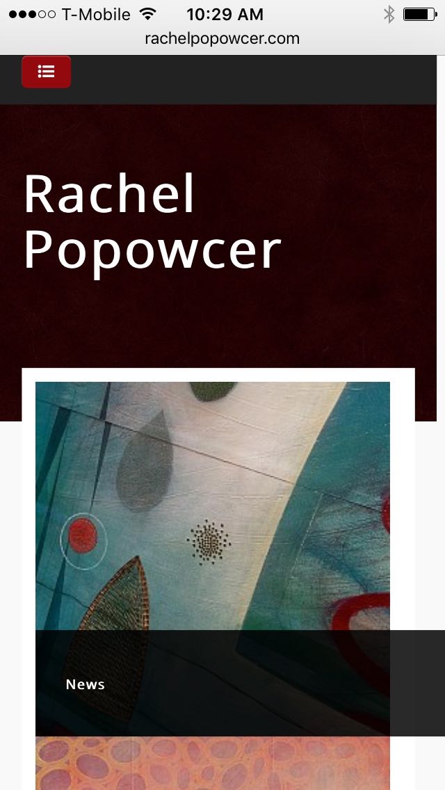
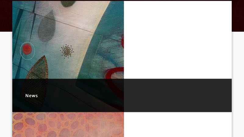
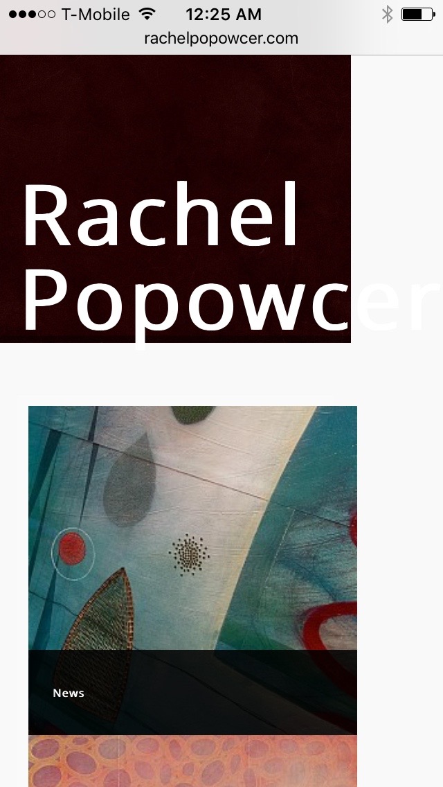
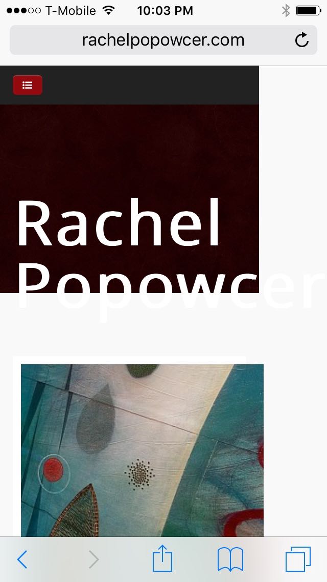
One more thing - the overlay does not size with the image. I will send a couple of screen shots from the phone. The overlay seems to extend to the right quite a bit rather than fitting the image width. The first screenshot is vertical and the second is horizontal so you can see how the overlay extends.

Thanks,
Melody

RachelPhone-screenshot-1.jpg


RachelPhone-screenshot-2.jpg
  • AllegroMelody's Avatar
  • AllegroMelody
  • 12 Month Developer
  • 534 posts
  • 1 Thanks
  • Karma: 2
The administrator has disabled public write access.
With this issue it's intended that people use the 100% width option in the module settings

So the image fills the space

Is that an option?

Cheers
Paul
  • manh's Avatar
  • manh
  • Moderator
  • 45248 posts
  • 2106 Thanks
  • Karma: 603
The administrator has disabled public write access.
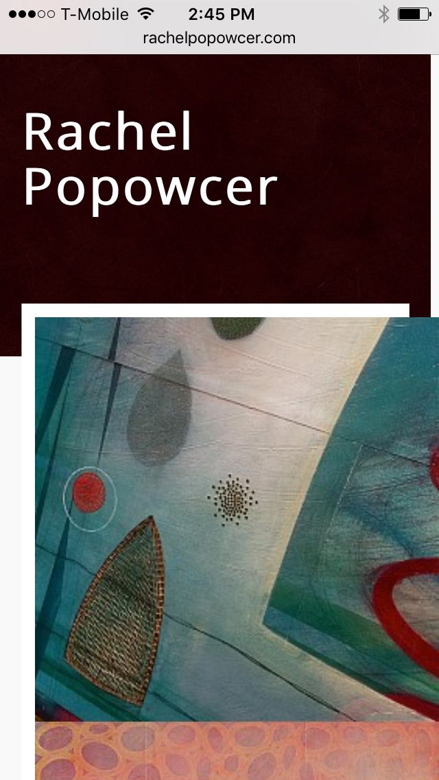
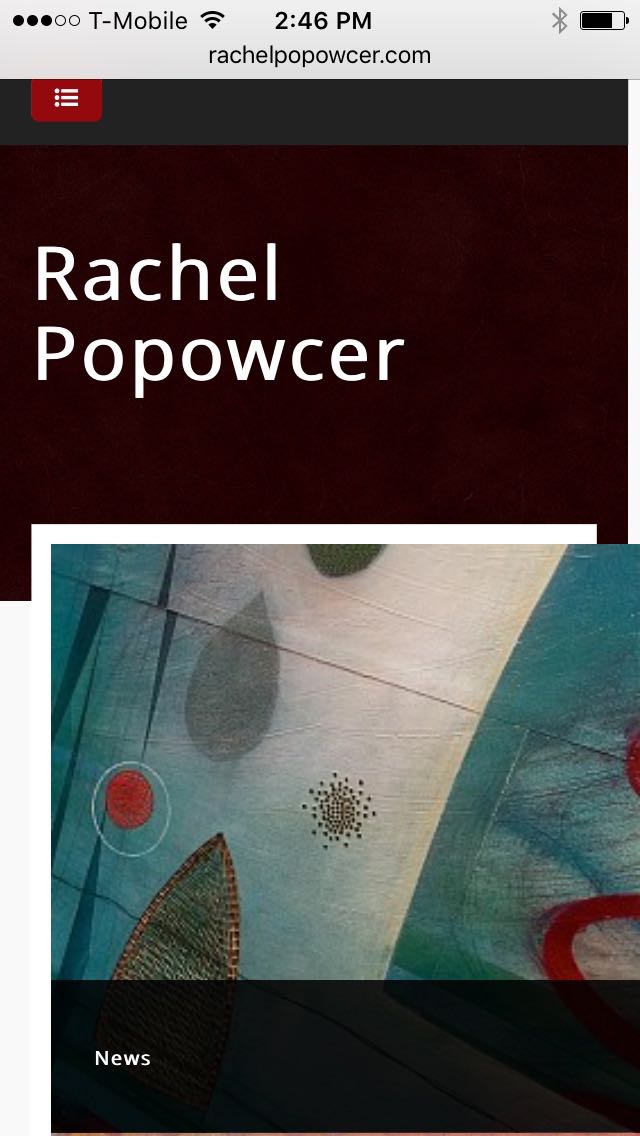
I tried the 100% setting but the image goes off the right side of the screen. Also, it's nice to be able to see the whole work of art rather than just some of it on the screen.

I've got two screenshots of the grid to see how the image goes off the edge.

thanks,
Melody


RachelPhone-screenshot-3.jpg


RachelPhone-screenshot-4.jpg
  • AllegroMelody's Avatar
  • AllegroMelody
  • 12 Month Developer
  • 534 posts
  • 1 Thanks
  • Karma: 2
The administrator has disabled public write access.
Hi Melody,

Is this still an iphone?

Cheers
Paul
  • manh's Avatar
  • manh
  • Moderator
  • 45248 posts
  • 2106 Thanks
  • Karma: 603
The administrator has disabled public write access.
Yes, it's on an iPhone 6. I can look on a Windows phone later tonight to see if it has the same effect.

thanks,
Melody
  • AllegroMelody's Avatar
  • AllegroMelody
  • 12 Month Developer
  • 534 posts
  • 1 Thanks
  • Karma: 2
The administrator has disabled public write access.
Hi Melody,

Can I just check what version numbers of zentools and the template do you have installed?

Cheers
Paul
  • manh's Avatar
  • manh
  • Moderator
  • 45248 posts
  • 2106 Thanks
  • Karma: 603
The administrator has disabled public write access.
Hi Paul,
Should be recent versions - Zen Tools 1.13.8 & Grid3 1.4.0

I just checked it on a Windows phone (older), and it does the same thing with the layout of the images and overlay, except on my iPhone, the overlay shows up when I tap on the image, and on the Windows phone, it shows up briefly but then goes to the link.

Thanks,
Melody
  • AllegroMelody's Avatar
  • AllegroMelody
  • 12 Month Developer
  • 534 posts
  • 1 Thanks
  • Karma: 2
The administrator has disabled public write access.
Hi Melody,

If you comment out all the custom.css changes to test, do you get the same issue?

Cheers
Paul
  • manh's Avatar
  • manh
  • Moderator
  • 45248 posts
  • 2106 Thanks
  • Karma: 603
The administrator has disabled public write access.
Is there a way to comment out the whole document? There are a lot of custom.css changes - do I need to comment out each one separately?

Here they are:

#grid1, #banner, #midCol {
background: #ffffff none repeat scroll 0 0 !important;
}


/* dropdown menu top spacing */

#navwrap ul.nav .dropdown-menu {
margin-top: 2px !important;
}

/* sidebar & grid2 spacing */

.sidebar .moduletable {
background: none !important;
margin-bottom: 3px !important;
padding: 2px !important;
}


.grid2 .moduletable {
background: none !important;
margin-bottom: 3px !important;
padding: 2px !important;
}

/* top image height */

#background {
height: 280px;
}

/* sidebar spacing */

.sidebar {
margin-top: 40px;
}


/* Paragraph line height */

p {
line-height: 20px;
}

/* headers */

h4 {
font-size: 1.2em;
background: url(../images/horbevel2.png) repeat-x left bottom;
}

/* menu horizontal spacing */
#navwrap ul.nav li a
{line-height: 1.8em;}

/* grid images spacing */
.thumb-grid img {
margin: 0 4px 6px 0;
}

/* line in Chrome */
.zt-slideshow.owl-carousel .owl-item {
padding-right:0 !important;
}

#midCol, #midCol.zen-content {
padding: 10px 4% !important;
}

/* Font size for cell phone screen */
@media only screen and (max-device-width: 480px) and (min-device-width: 320px) {
#logowrap a {font-size: 1.5em !important;}
}*/

@media only screen and (max-device-width: 480px) and (min-device-width: 320px) {
#logowrap {margin-top: 20px; margin-bottom: 15px;}
}
  • AllegroMelody's Avatar
  • AllegroMelody
  • 12 Month Developer
  • 534 posts
  • 1 Thanks
  • Karma: 2
The administrator has disabled public write access.
Deleted custom.css doc.

Screenshot:

WithoutCustomCssDoc-1.jpg


Then I uploaded it again.

So how do we figure out which custom.css code is the culprit?

thanks,
Melody
  • AllegroMelody's Avatar
  • AllegroMelody
  • 12 Month Developer
  • 534 posts
  • 1 Thanks
  • Karma: 2
The administrator has disabled public write access.
Hi Melody,

I'm a little unclear - does this part of the site display correctly with the custom css disabled?

Cheers
Paul
  • manh's Avatar
  • manh
  • Moderator
  • 45248 posts
  • 2106 Thanks
  • Karma: 603
The administrator has disabled public write access.
It appears so.

thanks,
Melody
  • AllegroMelody's Avatar
  • AllegroMelody
  • 12 Month Developer
  • 534 posts
  • 1 Thanks
  • Karma: 2
The administrator has disabled public write access.
Hi Melody,

The problem I I don't have that device and on the emulators it doesn't show that issue

did you end up adding some css for the line that showed on the right? - from a different forum question

Cheers
Paul
  • manh's Avatar
  • manh
  • Moderator
  • 45248 posts
  • 2106 Thanks
  • Karma: 603
The administrator has disabled public write access.

zentoolsIf you use Zentools please post a review at the Joomla! Extensions Directory.
Happy Campers