Support Forum

Please note that this forum is only available to you in read only mode. In order to contribute to this conversation you will need to renew your subscription.

Breakpoint for menu on tablets confusion

zentoolsIf you use Zentools please post a review at the Joomla! Extensions Directory.

Hi Paul,

I'm trying to get the menu to collapse on tablets both portrait and landscape but I can only get it to collapse on phones.

In the template manager, I've set the break point for tablets to everything from 780-1500px but it just won't respond. Am I doing something wrong?

Here is the site: pinatel721.com/stones/

If you could point me in the right direction, I would appreciate it.

Joanne
  • joanne721's Avatar
  • joanne721
  • 6 Month Developer
  • 285 posts
  • Karma: 0
The administrator has disabled public write access.
Hi Joanne,

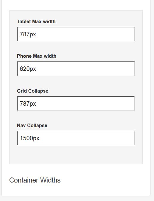
Can you attach a screenshot of your settings for the breakpoints and for the navigation row

Thanks
Paul
  • manh's Avatar
  • manh
  • Moderator
  • 45248 posts
  • 2106 Thanks
  • Karma: 603
The administrator has disabled public write access.
Sure. See attached.

J
Attachments:
  • joanne721's Avatar
  • joanne721
  • 6 Month Developer
  • 285 posts
  • Karma: 0
The administrator has disabled public write access.
I just tried moving the mobile menu from toolbar to top1 -- no difference.

Joanne
  • joanne721's Avatar
  • joanne721
  • 6 Month Developer
  • 285 posts
  • Karma: 0
The administrator has disabled public write access.
If you set to nav collapse for the navigation to hide and then change the nav collapse value?
  • manh's Avatar
  • manh
  • Moderator
  • 45248 posts
  • 2106 Thanks
  • Karma: 603
The administrator has disabled public write access.
I'm not sure what you mean.

My problem is that I can't figure out how to make the mobile logo and mobile menu visible on tablets landscape.

Here are my settings:

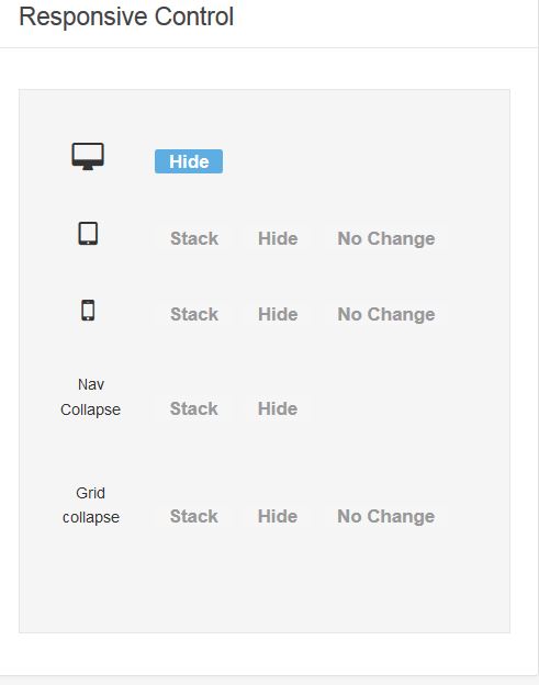
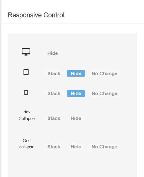
I have the main horizontal menu in the menu position set to 'hide' on tablet, phone, and nav-collapse. (This works. So far so good.)

I have the off-canvas-trigger-module and mobile logo in the Top position set to 'hide' on desktops. (It does.)

I want the nav to collapse on tablets both portrait and landscape so in the Layout tab I have tablet max-width set to 1024px and nav-collapse also set to 1024 pixels.

The nav collapses on phones and on tablets portrait so I know it's working. But on tablets landscape the mobile logo and mobile menu don't show at all. There is a white area above the content that looks like the modules would like to load but they don't.

What am I missing?

Joanne
  • joanne721's Avatar
  • joanne721
  • 6 Month Developer
  • 285 posts
  • Karma: 0
The administrator has disabled public write access.
Hi Joanne,

The menu and mobile logo on the desktop kick in at 1023

Is the remaining problem the white space?

Cheers
Paul
  • manh's Avatar
  • manh
  • Moderator
  • 45248 posts
  • 2106 Thanks
  • Karma: 603
The administrator has disabled public write access.
Hi Paul,

Thanks for all your help. Here are the four combinations I've tried with no luck:

1. In the layout tab if I set both the tablet breakpoint and the nav collapse break point to 1023 I get the regular horizonal nav and the regular logo -- when viewing the site on a tablet -- just as I would on a desktop or laptop. Except the menu wraps which is what I'm trying to avoid by collapsing the menu when the tablet is landscape.

2. If I set the tablet to 1024 and the nav collapse to 1023 I don't get anything. No regular horizontal menu, or mobile menu, no logo.

3. If I set the tablet to 1023 and the nav to 1024 (the reverse) I get the regular logo and neither menu -- no menu at all.

4. If I set both tablet and nav collapse to 1024 I get nothing, no menus, no logos either regular or mobile -- the same as scenario 2.

So, scenario #1 is the best but the menu wraps which is not ideal.

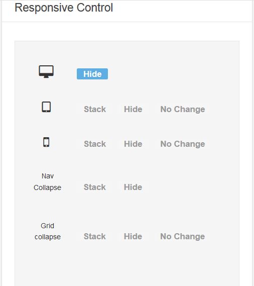
I have attached a screenshot of the responsive settings for the TOP position where the off-canvas-trigger-mobile and the mobile logo reside. Maybe I have to change something there?

Maybe I should use a different type of menu? I'll play around but if you have any other guidance, it would be welcome.

Thanks again.

Joanne
Attachments:
  • joanne721's Avatar
  • joanne721
  • 6 Month Developer
  • 285 posts
  • Karma: 0
The administrator has disabled public write access.
Hi joanne,

I really think you have this working when I looked at it yesterday

The snag was the white bar across the top but I was going to suggest some css to remove that

Are you able to back to that?

Cheers
Paul
  • manh's Avatar
  • manh
  • Moderator
  • 45248 posts
  • 2106 Thanks
  • Karma: 603
The administrator has disabled public write access.
It seemed to work in some of the responsive emulator tools online but not on others and not on my ipad. I finally created another horizontal menu in Toolbar position using TOP-LEFT (that is not as padded with a smaller font so it won't wrap) and got it to finally appear on the blasted ipad. I'm in the process of styling it.

I had to hide it in the template manager from phones and desktops then hide it with css on laptops and tablets portrait. Leaving it only on tablets landscape.

I am not that smart, unfortunately and get turned around with all the settings and all the places to set them -- but I like a puzzle even if I can't charge for it.

I'll tackle the white space once I've got a menu working. I think it's the sticky nav showing up but not sure.

Thanks for all your help. If you have any suggestions let me know.

Joanne
  • joanne721's Avatar
  • joanne721
  • 6 Month Developer
  • 285 posts
  • Karma: 0
The administrator has disabled public write access.
So I'm all set. I figured out an easy fix -- took me two days to think of it but that's beside the point.

I simply added a media query to the regular menu for tablet landscape reducing the font size and padding so it doesn't wrap.

The white space was #sticky-fill and I just hid it on phones and tablets.

As always, thanks for looking into this.

Joanne
  • joanne721's Avatar
  • joanne721
  • 6 Month Developer
  • 285 posts
  • Karma: 0
The administrator has disabled public write access.
Thanks Joanne,

Was just about to look

Cheers
Paul
  • manh's Avatar
  • manh
  • Moderator
  • 45248 posts
  • 2106 Thanks
  • Karma: 603
The administrator has disabled public write access.

zentoolsIf you use Zentools please post a review at the Joomla! Extensions Directory.
Happy Campers