Support Forum

Please note that this forum is only available to you in read only mode. In order to contribute to this conversation you will need to renew your subscription.

Getting the slideshow to be responsive

zentoolsIf you use Zentools please post a review at the Joomla! Extensions Directory.

Hello,
I have the template set to responsive, and I have mobile detect turned on, but I still can't get the background slideshow to be responsive. What am I missing?

www.survivalbreakdownbow.com
  • Douglas Rost's Avatar
  • Douglas Rost
  • LIfetime Developer - Big Bamboo
  • 152 posts
  • Karma: 0
The administrator has disabled public write access.
Hi Douglas

Can you turn off mobile detect for now

and what zentools2 version do you have installed?

Cheers
Paul
  • manh's Avatar
  • manh
  • Moderator
  • 45248 posts
  • 2106 Thanks
  • Karma: 603
The administrator has disabled public write access.
Hi Paul,
I have turned off mobile detect, and updated zentools2 to 2.3.2 and am still not seeing a change.
  • Douglas Rost's Avatar
  • Douglas Rost
  • LIfetime Developer - Big Bamboo
  • 152 posts
  • Karma: 0
The administrator has disabled public write access.
Hi Douglas,

Can you also click the compile master css and save?

Cheers
Paul
  • manh's Avatar
  • manh
  • Moderator
  • 45248 posts
  • 2106 Thanks
  • Karma: 603
The administrator has disabled public write access.
Clicked "Save and compile theme"... no change
  • Douglas Rost's Avatar
  • Douglas Rost
  • LIfetime Developer - Big Bamboo
  • 152 posts
  • Karma: 0
The administrator has disabled public write access.
Hi Douglas,

Sorry I got my templates mixed up

This is controlled by the template - what version number of the template do you have installed?

Cheers
Paul
  • manh's Avatar
  • manh
  • Moderator
  • 45248 posts
  • 2106 Thanks
  • Karma: 603
The administrator has disabled public write access.
No biggie...

1.3.1, and I see there is a 1.3.3 so I'll put that in now.

OK all in, and cache cleared, DB checks out fine, all good.... but no difference. :(
  • Douglas Rost's Avatar
  • Douglas Rost
  • LIfetime Developer - Big Bamboo
  • 152 posts
  • Karma: 0
Last Edit: 7 years 7 months ago by Douglas Rost.
The administrator has disabled public write access.
Thanks
  • manh's Avatar
  • manh
  • Moderator
  • 45248 posts
  • 2106 Thanks
  • Karma: 603
The administrator has disabled public write access.
Any thoughts??
  • Douglas Rost's Avatar
  • Douglas Rost
  • LIfetime Developer - Big Bamboo
  • 152 posts
  • Karma: 0
The administrator has disabled public write access.
Hi Douglas,

The slideshow uses the equivalent of the css background-size: cover rule.

The images will not always be 100% width of the screen, it tries to make the image as large as possible in the available space.
This means that the sides of the image sides can be cut at smaller widths, as, if the image was 100% width, it would not fill the height of the slideshow and a gap would be created.

The only way to really get around that is to use a squarer image, but background slideshows are not ideal when you want 100% of the image to be visible at all times.

Rob
  • Robert Went's Avatar
  • Robert Went
  • Moderator
  • 2210 posts
  • 196 Thanks
  • Karma: 90
The administrator has disabled public write access.
What's weird is that if you look at the site, the image size doesn't change at all, and in fact it only crops from the right side, the left stays put. I am using images that are 1200x300. If I were to use a square image, I would not have any control of what subject matter would be shown as so much would be cropped off.

Would it help to not use the built in slideshow of the template and instead replace it with a zentools2 slideshow?
  • Douglas Rost's Avatar
  • Douglas Rost
  • LIfetime Developer - Big Bamboo
  • 152 posts
  • Karma: 0
The administrator has disabled public write access.
Are you able to test with a sample image?


sizing.jpg
  • manh's Avatar
  • manh
  • Moderator
  • 45248 posts
  • 2106 Thanks
  • Karma: 603
The administrator has disabled public write access.
two files attached
Attachments:
  • manh's Avatar
  • manh
  • Moderator
  • 45248 posts
  • 2106 Thanks
  • Karma: 603
The administrator has disabled public write access.
Thanks Paul,
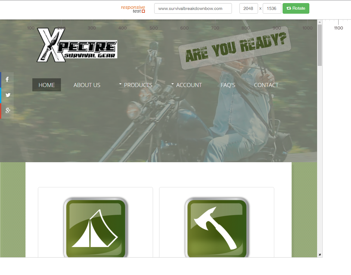
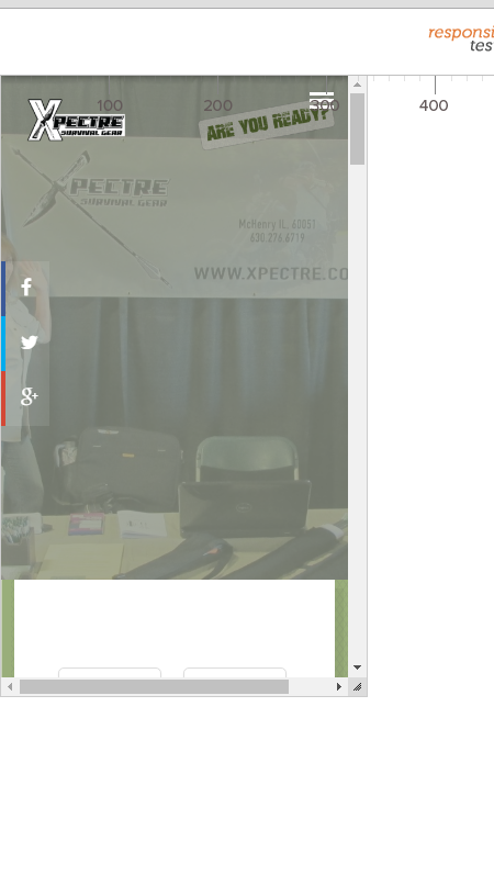
I tried the 2 images you sent over and the same thing happens, the images get distorted. The width somewhat changes, but the height never does. It ends up being too zoomed in on an area that usually is not significant to the picture. A perfect example is one image says "Follow us on social media", yet when viewed on an iphone 5 is says "llow us".
  • Douglas Rost's Avatar
  • Douglas Rost
  • LIfetime Developer - Big Bamboo
  • 152 posts
  • Karma: 0
The administrator has disabled public write access.
If you compare to the demo site on the template pages

bambootheme.com/showcase/feb15/

How does it look?

Cheers
Paul
  • manh's Avatar
  • manh
  • Moderator
  • 45248 posts
  • 2106 Thanks
  • Karma: 603
The administrator has disabled public write access.
Your images are not staying within the same ratio either, so sometimes it is cutting off top and bottom, and other times the sides, instead of scaling down and maintaining the same ratio so that all information is being viewed.

Here is what I am using for testing. Please adjust the size to see what I mean

responsivetest.net/#u=www.survivalbreakdownbow.com|3372|1128|2

As I asked before, would I get better results in putting a zentools2 slideshow in that space instead of using the one from the template?
  • Douglas Rost's Avatar
  • Douglas Rost
  • LIfetime Developer - Big Bamboo
  • 152 posts
  • Karma: 0
The administrator has disabled public write access.
Did you compare the images on your site with the demo site link?

Did the same images behave the same on your site as the demo?

Are you able to match the dimensions of the screenshot I attached with your images?

I don't think it will change behaviour with zentools2
  • manh's Avatar
  • manh
  • Moderator
  • 45248 posts
  • 2106 Thanks
  • Karma: 603
The administrator has disabled public write access.
Basically, I'm trying to find a way to compare the same images on your site as with the demo site we have

At the moment the background image on your site is being scaled as the screensize is reduced

Cheers
Paul
  • manh's Avatar
  • manh
  • Moderator
  • 45248 posts
  • 2106 Thanks
  • Karma: 603
The administrator has disabled public write access.
As looking at the site I see the same as Rob but with a comparison we can be sure

Hopefully I'm bit a clearer

Cheers
  • manh's Avatar
  • manh
  • Moderator
  • 45248 posts
  • 2106 Thanks
  • Karma: 603
The administrator has disabled public write access.
Hi Paul & Rob,
Thanks again for your help with this...

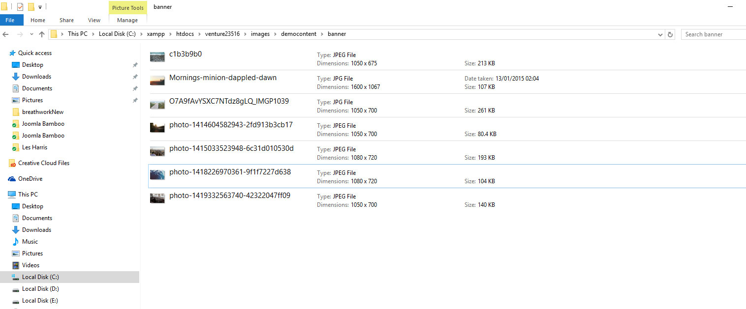
I have reworked a couple of the images so that they are roughly 1080x700 instead of the 1200x300 I had them at. At that size it is difficult to get the correct subject matter of the photo to line up because of the cropping. If I want an image that has wording as well, to use as a banner, things keep getting cut off.

When viewed on various mobile devices (see screen shots), the tablet is ok but the phone is not good at all as the image takes up 2/3 of the screen and the subject matter is wonky. OK, so I would be fine with turning that off when you get down to a phone, but I have not found a way of doing that in the template.

Is there a way to access the background slideshow through a module? I could then create multiple slideshows as modules accessing different image folders, that are cropped at different sizes, and turned on/off based on device.

ipad4.png


iphone5.png
  • Douglas Rost's Avatar
  • Douglas Rost
  • LIfetime Developer - Big Bamboo
  • 152 posts
  • Karma: 0
The administrator has disabled public write access.

zentoolsIf you use Zentools please post a review at the Joomla! Extensions Directory.
Happy Campers