
Zen Grid Framework Responsive Menu options
05 Mar 2012 - Written by Anthony Olsen
Posted in Joomla Templates

One of the key features of the version 2 of the Zen Grid Joomla Template Framework is it's responsive / mobile friendly functionality. Used with the Zentools module, it is a powerful tool for preparing your website across a range of screen sizes including targetting iPad and iPhone displays, without having to worry too much about creating a separate template for mobile users.
Working with menus on small screens ...
One of the challenges of responsive design is determining the best method for treating navigation on small screens. As with most things it seems that there is not one definitive solution (well not yet anyway) and that different approaches may be required for different contexts.
I think Brad Frost's synopsis on responsive design patterns is the most thorough overview of the available solutions to date and after reading that post it became clear that we needed to add a new option to the mobile menu option in the framework.
Say hi to the toggle menu option ...
Up until now the framework has implemented the selectbox method which essentially transforms your menu into a select box on small screens. I personally like this option and think the end result is slick - that is ... so long as you are using Safari or browsing on an iPhone.
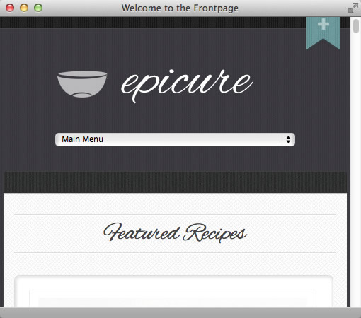
You can see it below in the recently released Epicure Joomla template.
However with the release of the v2.2.0 of the framework (which you can download from here) you can now choose from a toggle menu or a select box or indeed disable any of the responsive menu options. This option is now available after installing v2.2+ of the framework and updating your current template. Please check out the changelog for your template to ensure you complete the update.
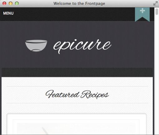
Here is a screenshot of the toggle menu before it has been opened.
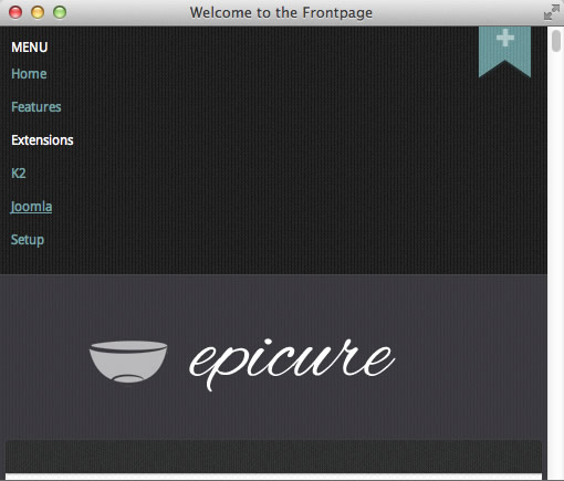
And then once you have toggled the menu open.
Please note that this option is not available in the Platform template due to unique nature of this Joomla template.
An extra step ...
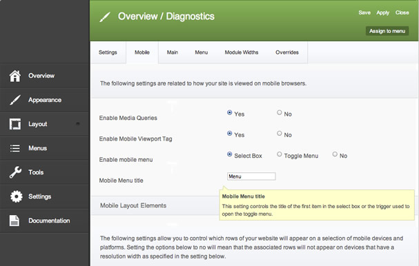
One key thing to remember when setting up the toggle menu is that whereas the select menu is dynamically populated via a crafty snippet of jQuery, the toggle menu option employs a new module position called "togglemenu". So after setting the mobile menu option in the template parameters to use the toggle menu.
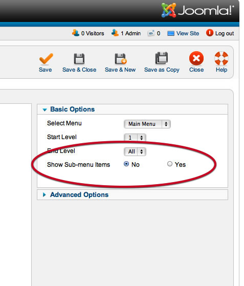
You then need to publish a duplicate - or even a new menu - to the togglemenu position. One of the benefits to this is that you can publish any module you like here which frees up some of the limitations of the select box option.
For best results I would recommend hiding sub level menu items to avoid an excessively long toggle.
You can read a slightly more indepth doc regarding the responsive menu options over at the Joomlabamboo knowledgebase.
More options coming ...
I am really loving the flexibility that responsive design is adding to our Joomla themes and so in the next few weeks and months we will be really honing the responsive / mobile options available. If you have somethign you want implemented in the framework please post below and we will add it to the feature list for a future update.
blog comments powered by Disqus